SSRS Report Builder Visuals
Assignment
A design-led effort to modernize data visuals across an ecosystem of Microsoft products within existing technical constraints.

What's the problem?
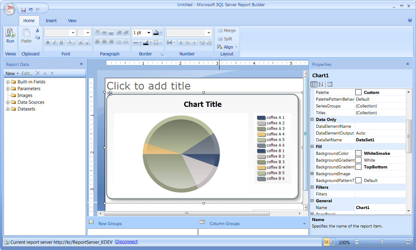
SQL Server Reporting Services (SSRS) is a billion-dollar product, but the look of the data visuals did not keep pace with the changes to the user-interface-- the context that visuals appear in. The development team is not going to code a new visual engine for SSRS. How close can we get the default visuals of SSRS to match visuals in Power BI?
How did I solve the problem?
I performed an audit of all data visuals in SSRS and their individual properties, creating a massive excel spreadsheet in the process. In the spreadsheet, I documented how the visual properties should be defined to match existing Power BI visuals and extended the patterns to SSRS visuals that didn’t exist in Power BI. Afterwards, I created a report using Report Builder that utilized all the available visuals with the new property definitions. The developers were able to take an RDL snippet from my file to implement the properties as the new default for the next update. I still receive requests from current and former managers to forward the excel spreadsheet to designers working on data visuals for other Microsoft products in Power Platform at least once a year.

Though not technically a deliverable for the assignment, I documented limitations and other opportunities to improve the usability of the product. My experience as a game tester on the Xbox 360 taught me that problems in development don’t get solved without bug reports and documentation.

Impact
When the new data visuals were rolled out, customers were in disbelief. They kept asking if SSRS was now supporting imported visuals from other Microsoft products, and my project manager was excited to repeat that they were created with SSRS and could be rendered in HTML5. The new experience was shipped while Power BI was in preview, tying nicely with another experience that I designed: pinning a visual from an SSRS report to a Power BI dashboard.

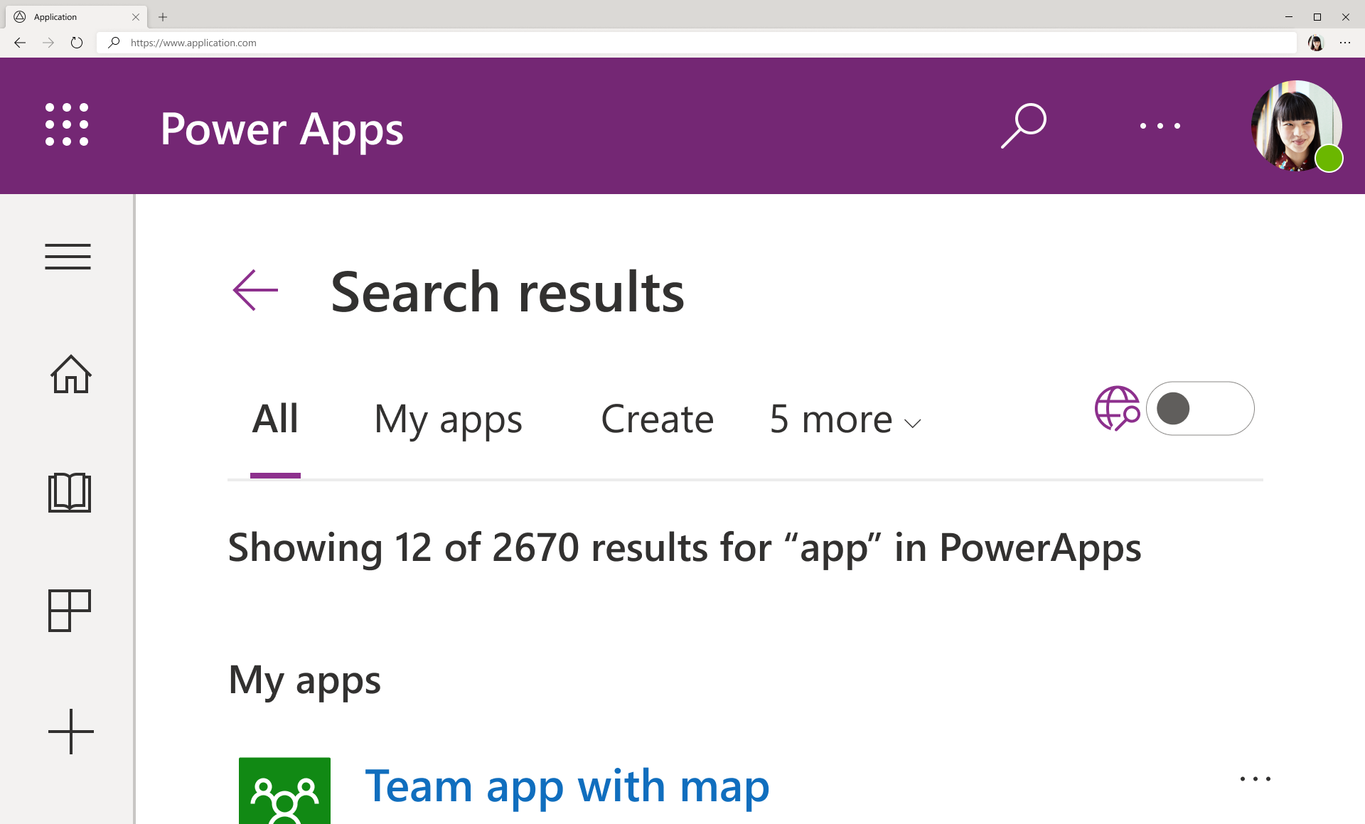
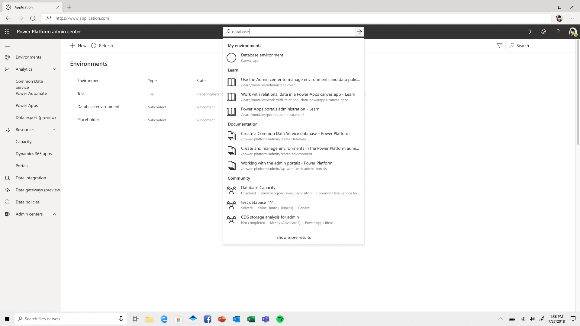
Universal Search in Power Platform
Assignment
For the "Cross-Suite Experience," or, the CSX Design Team-- create a Search experience for all of the Power Platform products, starting with Power Apps.

What's the problem?
First-time makers of Power Apps are leaving the platform to search for answers on Google, (if at all, due to privacy concerns.) Telemetry suggests if they didn’t find the answers, they often didn’t come back. The lack of a universal search experience on the Power Platform is harming user trust, people want to easily and securely find relevant information to address their maker needs.

How did I solve the problem?
Working closely with other designers, research, development, and PM stakeholders we created user journey maps and identified likely funnel stages for users to drop off the app creation process then provided search categories based on users needs at each stage of the funnel.


Accessibile designs included proper keyboard and tab navigation, infomrative screen-reading, as well as responsiveness that works at 400% zoom.

Impact
Telemetry from early on in preview showed that 40% of users started to use the Search experience, incredible for a new feature. This demonstrated the importance of Search as a tool for learning at a crucial time. Unfortunately, due to the re-org, we lost the data-scientist that was supposed to measure exactly how accurate our journey maps had been at predicting where users were dropping off in the app-creation process at this time. However, at Microsoft Build 2020, Satya Nadella touted “two years’ worth of digital transformation in just two months.” In March, there was a 50% increase in first-time Power Apps users and 70% in professional developers, and around 70,000 new organizations started using Power Apps that year. As MAU of Power Apps grew, the results of implementing Search were positive enough that the experience has been expanded into the rest of the Power Platform products, such as Power Automate, and Power Virtual Agents. I’m currently working on an updated experience in Power Platform Admin Center, and the studies we planned for Power Apps will go forward prior to implementing the Universal Search in Power Pages next year.


Redesign App from Data
Assignment
Through several initiatives, we are attempting to improve the number of Monthly Active Users (MAU), and research shows that if users don't successfully create an app in a single day, they don't come back. As a member of the Power Apps Studio on the “Quick Wins” Team, I was tasked with redesigning the "Start from data" experiences starting with the data sources SharePoint, then Excel, SQL Server, and Dataverse (then referred to as Common Data Service or CDS).
What's the problem?
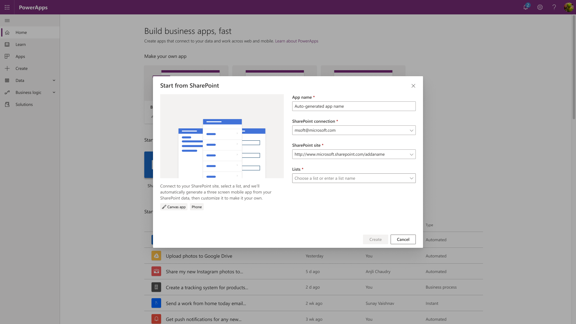
Seen in the video below, from 2:06 to 2:30-- the Start from Data experience simply doesn't feel approachable. The "Start from SharePoint" button opens a different new tab, doesn't signal to the user how many steps the process will take, or inform them of what the result will be in any way.
How did I solve the problem?
I leveraged established design patterns by team members that created the Business Applications Group style guide as well as analogous experiences and react.js components from across the Power Platform suite of products to create a modal dialog with three steps.

Each drop-down automatically selects the first option as it loads, allowing the user to change the selection if necessary or immediately hit the "Create" button to generate a simple 3-screen app.

Impact
Data in preview demonstrates a massive improvement over the current "Start from SharePoint" experience. Any app “saved” or “published” increases MAU, at the time this experience shipped a license for Power Apps per user was $40/month and per app was $10/month.

Other projects
SSRS & Power BI
Pinning a SSRS Report visual to a Power BI dashboard.
This portion of the video shows off the ability to pin SSRS report visuals to a Power BI Dashboard.
Dynamics 365 App for Outlook
Interaction design for "Track" and "Track regarding."
Tracking and track regarding experience in Dynamics 365 App for Outlook, aka MailApp.
A11y - Color Contrast Checker
Accessibility plug-in for Figma
Spell check but for accessible color-contrast ratios in text over a background color or image. It now exists in the Figma Community as a plugin called A11y - Color Contrast Checker
Install for Figma nowCOVID-19 Emergency Response App
Visual design for mobile app and logo.
Some work of mine that appeared in promotional material.
Persona
Can I call myself a "Renaissance Man" without sounding pretentious?
No? Darn. However, I would use the phrase to describe the figures I aspire to imitate, such as Leonardo da Vinci, Miles Davis, and Bruce Lee. Trying to follow their success, I developed a passion for learning and analysis. Whether it’s design, music, or martial arts, I try to practice efficiently and cultivate attributes that I can apply to the rest of my life. I meditate and play video games to unwind from day-to-day, but I feel most at peace in the forests of the Pacific North West.